Posts

DIGA3035 M5CP2 - Animation
Image
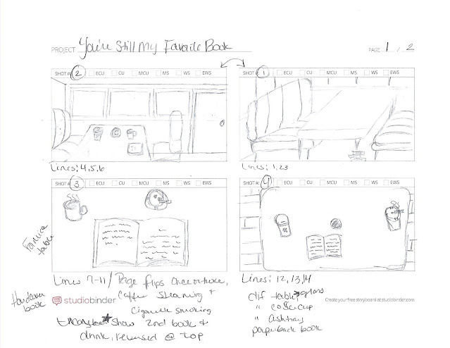
I was able to simplify my idea for the video from the previous sketches, and I think that I will be able to create it based off of the storyboard below. I have also included a copy of the poem itself and marked off which lines will be combined for each part of the animation. Please excuse the order of shots and how poorly my scanner works. Shot 1 (top right): Will be emphasizing the books under the table leg. Lines: 1, 2, 3. Shot 2 (top left): The table showing one or two books along with an ashtray, a coffee cup, and a glass cup. Lines: 4, 5, 6. Shot 3: close up of my side of the table with my steaming coffee, smoking cigarette in ashtray, and book where the pages will flip after every other line read. I will include a second book and drink reversed at the top of the screen, a partial of them, this book's pages will flip on alternating lines from the first. Lines: 7 to 11. Shot 4: A new table, just one book (now a paperback), a different ashtray and coffee cup. Cigarette will...

DIGA3035 M5CP1 - Animation

Image
I chose to do an animation for my final project since the other option was a website which I have already created in the previous course. For this project I have chosen to animate my poem that was published in the Black River Review in 2019. I have done some sketches (a small art board) for one of my two ideas and am still trying to think of how the alternative would look. Below are the sketches for the first option and I have also included the design brief that I came up with. DESIGN BRIEF Title : “You’re Still My Favorite Book” poem animation Delivery Mechanism : shared online via Vimeo Format : animation created with Adobe Animate Schedule :  ·        November 23, 2020 to November 29, 2020: creation of storyboard ·        November 29, 2020: post of storyboard to blog & forum for feedback ·        November 30, 2020 to December 13, 2020: creation of animation ·     ...

DIGA3035 M4 CP - Design Competition (Part 2)

Image
  Above are the final three spreads for the competition. I have shared them with friends and family. They all really liked them, but feedback was a bit on the slim side. For the second spread, pages 10 and 11, a friend recommended changing "work" to "play," but I have a hard time seeing the photo as playing a game instead of working. The third spread, pages 16 to 17, one person said that the socks look odd; it was a strange empty space on the picture and maybe I could change the socks to maybe like a chalkboard or some sign. I could also raise the washer, dryer, and laundry basket up a bit, but I really want to keep Thunder centered. I'm not sure if children's books have page numbers, but I added them so I can reference them by the page numbers.  The competition requires the manuscript (the numbers on the left are the page numbers): 1. I want you to meet my best friend. 2-3. He’s small, fuzzy, and silly. 4-5. And his name is Thunder…but we call him “Little M...

DIGA3035 M4 CP - Design Competition (Part 1)

Image
For my competition I chose the Clairvoyants 2020 Illustrated Children's Book Projection Competition (fourth edition), found  here . The requirements for this contest is a full storyboard or script, three finished double spreads, and a summary. I have chosen to do a book for younger children, five and younger since this is the age group of my niece. I decided to write the book about one of my cats, Thunder, who is all black, because I think black cats still need more appreciation and love since they're always the last cats to get adopted in shelters. All but the first and last pages will be double spreads for a total of thirteen lines and thirteen illustrations on twenty-four pages.  Here is the manuscript (with the page numbers before each line), I have bolded the lines for the illustrations that I will be doing: 1. I want you to meet my best friend. 2-3. He’s small, fuzzy, and silly. 4-5. And his name is Thunder…but we call him “Little Mister” and “Tunat.” 6-7. He’s always ne...

M3 CP - CD Design (Part 2): My Madness Mix FINAL PRODUCT

Image
For my final product I first used Photoshop to create the cover image from the following three photos: I used the dock from the first picture and lowered it's brightness so it matched the darkness of the second image, which is the main one. I then added the mountains from the third image. The water didn't match in the second and third photos so I copied the mountains and flipped them vertically and lowered the opacity so that it appeared to be a reflection. I also did the same with the night sky from the original. I used masks to blend the three photos together.  After the image was complete, I imported it to Illustrator and added the text and doodles. The text's colors are from the original image by using the eye dropper tool. The rocket ship was used on every page, a simple place in InDesign. The flower-like design I had to go back to Illustrator to draw two new versions to be placed in InDesign.  The size of the final image was too large for the CD booklet dimensions so ...

DIGA3035 M3 Discussion

Image
Part One: I decided to just go through the album covers of the CDs I have from years ago since I have these in person. The albums below happened to be from the same genre even though I have many types of music in my CD collection. I may also be drawn to these artists because of my love for their music.  From left to right is Garbage's 2001 release Beautiful Garbage , Linkin Park's Hybrid Theory from 2000, and Korn's 1998 release Follow the Leader .  These covers have always stuck out in my mind, when I hear the songs from the albums I can see the covers. The rose falling away into pixelated pieces along with "beautiful" from the title being blurred always makes me think of the loss of something important, beautiful to oneself. Linkin Park's cover art is stark and artistic, the man with the drawn wings behind connects to the album's title as does the Follow the Leader 's art. But the art of the latter album is a bit more of a direct interpretation of th...

DIGA3035 M3 CD Design Part 1: My Madness

Image
The songs I chose are eight of the most listened to for the past few months. My Recently Played playlist is filled with songs from varying genres and fit for different moods, but these eight are some of the ones I keep coming back to. The title I’ve gone with is “My Madness” because I feel that this collection touches upon the different emotions I go through a day. I’ve ordered them from sad with a recognition of self to hopeful love to determination/motivation to peace.  For the cover I’m thinking of a lake scene as the sun is rising. Most of the image will be shadowy and dark. The sky above will be the night sky on the left while it lightens as it goes right where you will see early dawn colors. I’m not sure about placement of the title, maybe in the water and have it be a bit wavy like the water’s surface.    For the middle pages (2 through 7) I will have the sky color theme run across them. Many of the booklets I’ve looked at have images of the band/artist on the cent...