DIGA3035 M3 Discussion
Part One:
I decided to just go through the album covers of the CDs I have from years ago since I have these in person. The albums below happened to be from the same genre even though I have many types of music in my CD collection. I may also be drawn to these artists because of my love for their music.
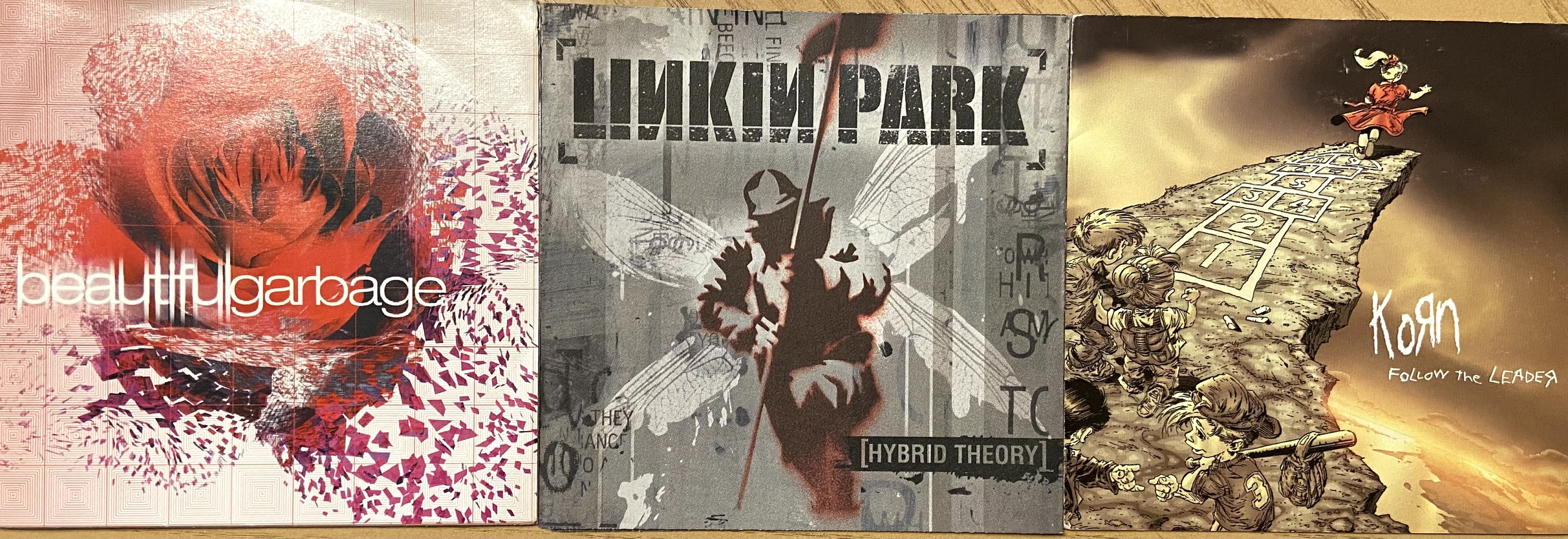
From left to right is Garbage's 2001 release Beautiful Garbage, Linkin Park's Hybrid Theory from 2000, and Korn's 1998 release Follow the Leader.
These covers have always stuck out in my mind, when I hear the songs from the albums I can see the covers. The rose falling away into pixelated pieces along with "beautiful" from the title being blurred always makes me think of the loss of something important, beautiful to oneself. Linkin Park's cover art is stark and artistic, the man with the drawn wings behind connects to the album's title as does the Follow the Leader's art. But the art of the latter album is a bit more of a direct interpretation of the title. Each cover has red as a standout color, the work is different mediums and styles, but they all represent the darker side of life.
Part Two:
The alignment of the poster is mostly in the center and vertical while the text is at the top horizontally. The first aspect that I saw was the gun outline quickly followed by the faces of the actors/characters within the outline. Maybe I saw the gun first because it's the biggest shape or maybe because it's a survival instinct to look for and find any dangers first. I saw the faces inside next because it's what is within the image of the gun.
The image of the gun/faces is the largest item on the poster because of the importance of the storyline (I'm assuming). The butterfly is fairly close in proportion to the gun, but I don't know what its significance is. The color scheme is simple. The yellow butterfly stands out compared to the simple light and mid-tone blues and the black of gun outline/shadow and darker faces inside. "Breathe" is darker in the title to emphasize the importance of this word to the title and, most likely, the plot.
As I stated before, I see the gun first, followed by the faces within, the gun leads the eye to the butterfly at the muzzle and towards the title at the top. I think it is balanced, even though the gun is more to the left than the center because of how it was placed directionally, the text on the right of this image balances that shift out. The negative space emphasizes the image of the gun/faces/butterfly since there is less to distract from it.


Comments
Post a Comment