Posts

DIGA3035 M6CP2 - Animation

 You're Still My Favorite Book, poem animation So, I have to say I am so not a fan of Adobe Animate. I struggled and fought with this program nearly every step of the way. I would do one thing and repeat it exactly the same but it wouldn't work the second time. I'm glad that I went with something so simple because I think I would have lost my mind trying to making anything more difficult. I can't tell you how many things I Googled and how many addition videos I watched in addition to the tutorial. Exporting was a real pain too. Before I had considered iMovie the most wretched program, but now that coveted spot belongs to Animate. As I said, I went with simple animation: the moving of the text and silhouettes along with the smoke/steam effect. I went with the silhouettes from Dzmitry that I found on Adobe Stock because the silhouettes I created looks horrifying. I also used royalty free music by Bensound. I did consider narrating the poem, but I chickened out in the end....

DIGA3035 M6CP1 Animation

Image
 I'm a bit behind and am finalizing the bits that need to be put into Animate. Below are the backgrounds and character silhouettes that I am still debating on using. I also have to finalize the narration for the piece and pick out a font and decide where to put the lines in the actual animation. I am also thinking about background sounds and possibly some music.  Shot one: Lines 1, 2, 3. Zooms in to books. Shot two: lines 4, 5, 6. I may add the following silhouettes whose arms will move, I have created layers so that the silhouettes can be below the table and on top of the benches. Possible sounds of cup/glass being set onto table. Smoke from cigarettes and coffee. Shot 3: lines 7-11. Smoke for both coffee and cigarette. Page will flip per line (maybe with sound). Shot 4: Lines 12, 13, 14. Smoke again for coffee and cigarette. Pages on tablet will flip. Shot 5: Line 15, silhouettes will be separated and move towards each other, possibly arms around each other. These silhouette...

DIGA3035 M5CP2 - Animation

Image
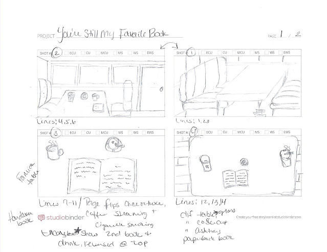
I was able to simplify my idea for the video from the previous sketches, and I think that I will be able to create it based off of the storyboard below. I have also included a copy of the poem itself and marked off which lines will be combined for each part of the animation. Please excuse the order of shots and how poorly my scanner works. Shot 1 (top right): Will be emphasizing the books under the table leg. Lines: 1, 2, 3. Shot 2 (top left): The table showing one or two books along with an ashtray, a coffee cup, and a glass cup. Lines: 4, 5, 6. Shot 3: close up of my side of the table with my steaming coffee, smoking cigarette in ashtray, and book where the pages will flip after every other line read. I will include a second book and drink reversed at the top of the screen, a partial of them, this book's pages will flip on alternating lines from the first. Lines: 7 to 11. Shot 4: A new table, just one book (now a paperback), a different ashtray and coffee cup. Cigarette will...

DIGA3035 M5CP1 - Animation

Image
I chose to do an animation for my final project since the other option was a website which I have already created in the previous course. For this project I have chosen to animate my poem that was published in the Black River Review in 2019. I have done some sketches (a small art board) for one of my two ideas and am still trying to think of how the alternative would look. Below are the sketches for the first option and I have also included the design brief that I came up with. DESIGN BRIEF Title : “You’re Still My Favorite Book” poem animation Delivery Mechanism : shared online via Vimeo Format : animation created with Adobe Animate Schedule :  ·        November 23, 2020 to November 29, 2020: creation of storyboard ·        November 29, 2020: post of storyboard to blog & forum for feedback ·        November 30, 2020 to December 13, 2020: creation of animation ·     ...

DIGA3035 M4 CP - Design Competition (Part 2)

Image
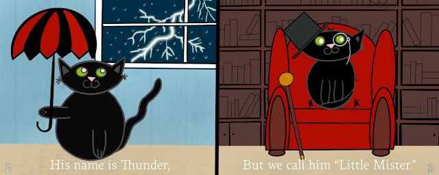
  Above are the final three spreads for the competition. I have shared them with friends and family. They all really liked them, but feedback was a bit on the slim side. For the second spread, pages 10 and 11, a friend recommended changing "work" to "play," but I have a hard time seeing the photo as playing a game instead of working. The third spread, pages 16 to 17, one person said that the socks look odd; it was a strange empty space on the picture and maybe I could change the socks to maybe like a chalkboard or some sign. I could also raise the washer, dryer, and laundry basket up a bit, but I really want to keep Thunder centered. I'm not sure if children's books have page numbers, but I added them so I can reference them by the page numbers.  The competition requires the manuscript (the numbers on the left are the page numbers): 1. I want you to meet my best friend. 2-3. He’s small, fuzzy, and silly. 4-5. And his name is Thunder…but we call him “Little M...

DIGA3035 M4 CP - Design Competition (Part 1)

Image
For my competition I chose the Clairvoyants 2020 Illustrated Children's Book Projection Competition (fourth edition), found  here . The requirements for this contest is a full storyboard or script, three finished double spreads, and a summary. I have chosen to do a book for younger children, five and younger since this is the age group of my niece. I decided to write the book about one of my cats, Thunder, who is all black, because I think black cats still need more appreciation and love since they're always the last cats to get adopted in shelters. All but the first and last pages will be double spreads for a total of thirteen lines and thirteen illustrations on twenty-four pages.  Here is the manuscript (with the page numbers before each line), I have bolded the lines for the illustrations that I will be doing: 1. I want you to meet my best friend. 2-3. He’s small, fuzzy, and silly. 4-5. And his name is Thunder…but we call him “Little Mister” and “Tunat.” 6-7. He’s always ne...

M3 CP - CD Design (Part 2): My Madness Mix FINAL PRODUCT

Image
For my final product I first used Photoshop to create the cover image from the following three photos: I used the dock from the first picture and lowered it's brightness so it matched the darkness of the second image, which is the main one. I then added the mountains from the third image. The water didn't match in the second and third photos so I copied the mountains and flipped them vertically and lowered the opacity so that it appeared to be a reflection. I also did the same with the night sky from the original. I used masks to blend the three photos together.  After the image was complete, I imported it to Illustrator and added the text and doodles. The text's colors are from the original image by using the eye dropper tool. The rocket ship was used on every page, a simple place in InDesign. The flower-like design I had to go back to Illustrator to draw two new versions to be placed in InDesign.  The size of the final image was too large for the CD booklet dimensions so ...