M2 CP Identity Design Part 1
Here are my sketches for The Hudson Valley Inn:
I tried to incorporate a leaf or trees, which would be in fall colors, and I wanted a scenic quality. I also like the idea of a river in the design since the valley is around the Hudson River. In one I included a a scroll for more of an older feel since the area has was settled a long time ago plus the word "inn" makes people think of times past.
Here are my sketches for the restaurant:
I was thinking of naming the restaurant The Riverview Restaurant because I imagine that the inn is located on the river itself. I incorporated a fall leaf in a couple, the scroll from one of the designs for the Inn's logo for continuity if I chose to use it, a view of the river, and one with the river and trees.
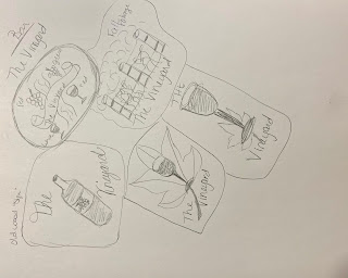
And here are my sketches for the bar:
I was thinking of naming the bar The Vineyard because the area has had viticulture since about 1677 and some vineyards have special fall tours and celebrations. I tried to include either a bottle or a glass of wine. The fall leaf is in two, the continuity scroll in one, and I thought maybe some grape vines in another, but it may be too busy or grand an idea for a simple logo.
Here are the photos I took with my phone, the color is off but it's less grainy. I'm really not sure what I did when I exported them as jpegs with Illustrator....


Comments
Post a Comment